In 1996, the moment of choosing what the designs of the new euro coin were going to be like had arrived. In order to select them, the European Commission launched a contest. We all know the final results of that contest, but there were another 8 non-selected design proposals for the common side of the Euro coins. Today, we take a look at them.
The European Commission Contest
In 1996, the Euro was very close to becoming a tangible reality. All the political and economical groundwork was almost finished, and the only thing left to do was to outline the logistical plan for the common currency. It was time to design the coins that, in the near future, would be changing hands among 350 million people.
That year, after having decided that the obverse of the Euro coins would be the same one for each and every country in the Eurozone, the European Commission called for a design contest open to every citizen in every country in the European Union except for Denmark, which had already decided to opt-out from the Euro.
The contest would consist of three phases: a national stage, a European stage, and a final stage. The final prize for the winner would be 24,000 euros.
The possible design topics would be limited to three: abstract art, architecture, and famous European personalities. Artists, sculptors and coin designers from all over the continent sent hundreds of entries to the contest.
For the European stage of the contest, the European Commission received from the national stages a grand total of 36 designs. A panel of independent experts examined them, and, out of those 36, it selected 9 to go through to the final stage.
In the subsequent months, those 9 designs were introduced to different European associations (blind people, consumer organizations…) and to the general public. And, soon, it would become clear that one of those designs, by one Luc Luycx, a Belgian coin designer, was clearly winning hearts and minds: a survey ordered by the Commission at the time showed that 63.8% of the people chose it as their favorite.
The announcement of the final winner was made at the European Commission Summit held in Amsterdam (the Netherlands) on July 16th and 17th, 1997. The event was scheduled for the second day of the summit.
This is the original version of the winning design, by Luycx:
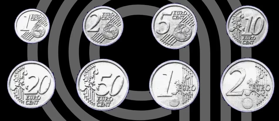
Although the design may look quite familiar to you, if you pay close attention, you will see some differences with the one that eventually ended in the pockets of Europeans. In the winning draft, there’s no engraver’s mark (LL, after Luc Luycx), and, furthermore, there’s a circle in the 1 and 2 euro coin that indicates that some room was left for a security hologram.
But, as I told you earlier, there were another 8 non-selected proposals for the common side of Euro coins. Unfortunately, I wasn’t able to find out who the authors were. Here they are:
Proposal 1
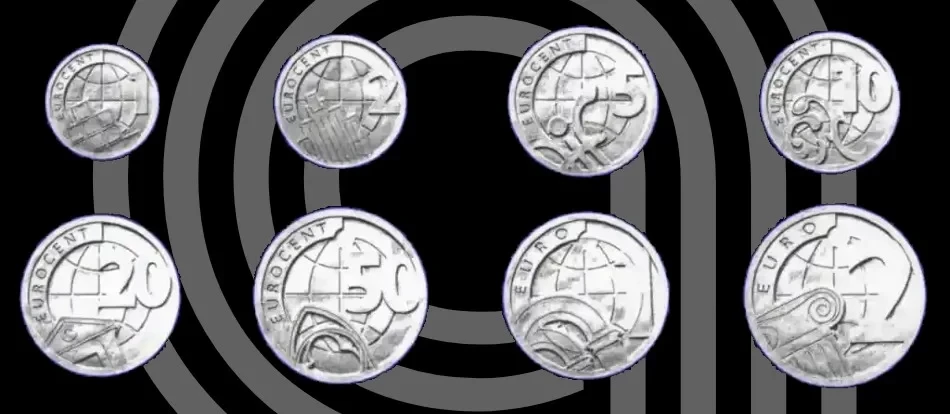
Proposal 2
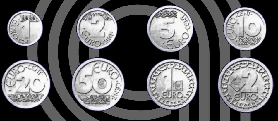
Proposal 3
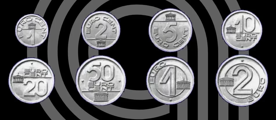
Proposal 4
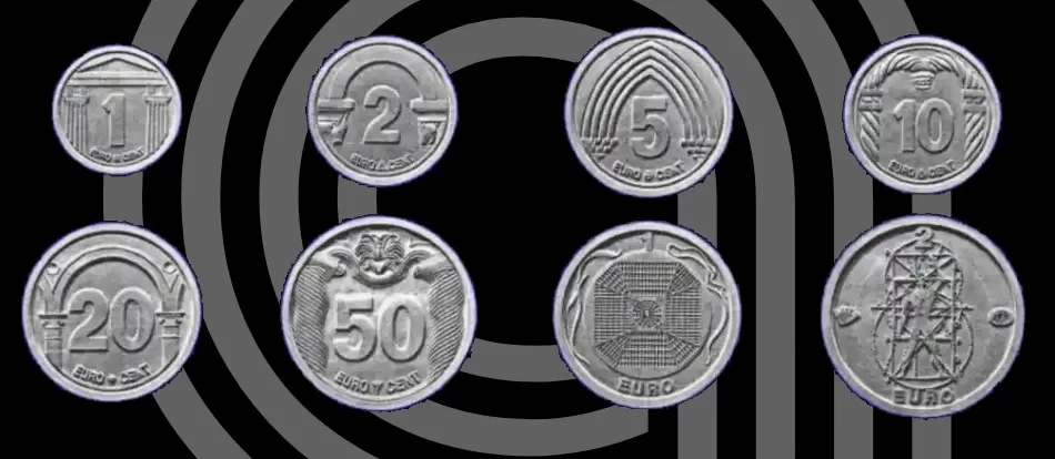
Proposal 5
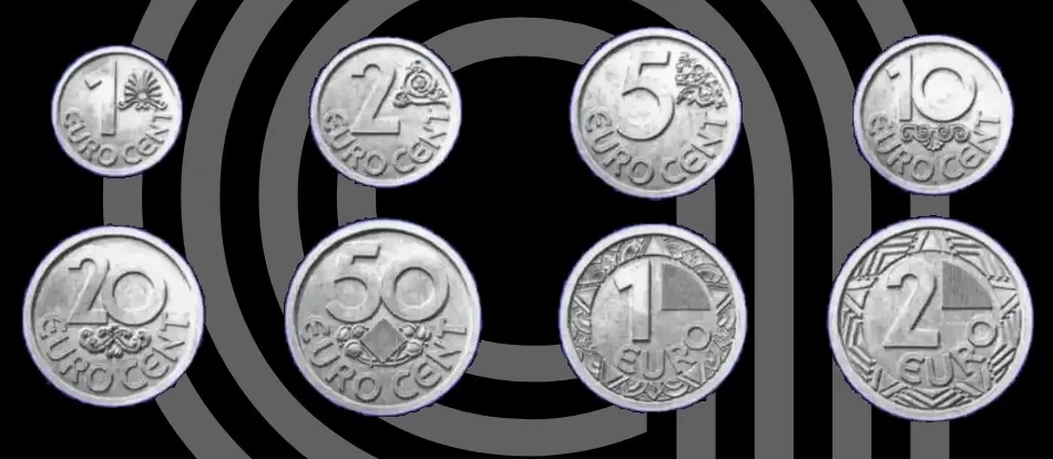
Proposal 6

Proposal 7

Proposal 8
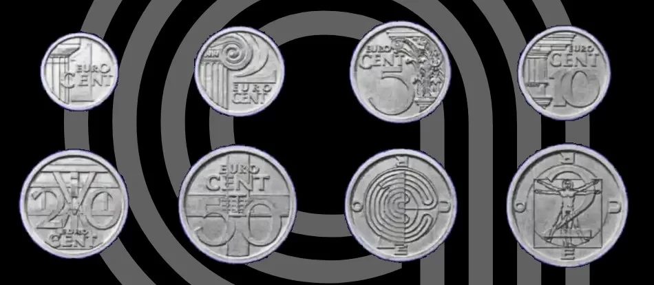
I don’t know if, as an European myself, it’s because I am already used to them, but I would have voted for Luycx’s design too. What about you? Tell me in a comment down below!